|
Form Styling with the Form Builder.
Posted by Richi M. on 29 November 2011 09:14 AM
|
||||
|
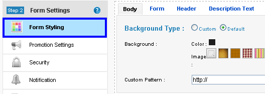
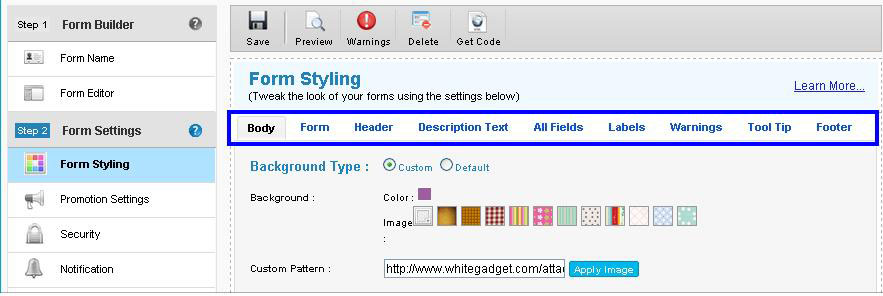
The Form Styling section allows the designing and modifications to the appearance of your forms. 1) Click on Form Stylings in the Additional Form Settings in the Form Editor.
2) The modification options are visible in tabs above the form.
3) Each modification is applied directly to the form.
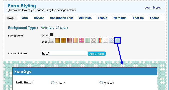
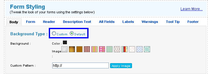
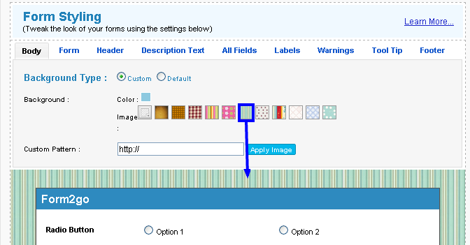
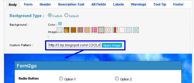
Click on the Body tab to adjust settings to the body of the form. 1) Clicking on the Background type option to select a custom background design or a default background.
2) Select the right pattern to appear as background to your form.
3) The custom pattern field allows the entry of an image link to make for the form background.
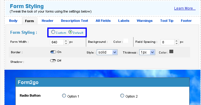
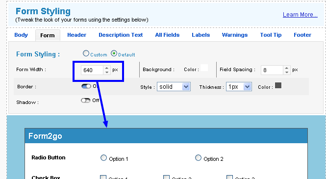
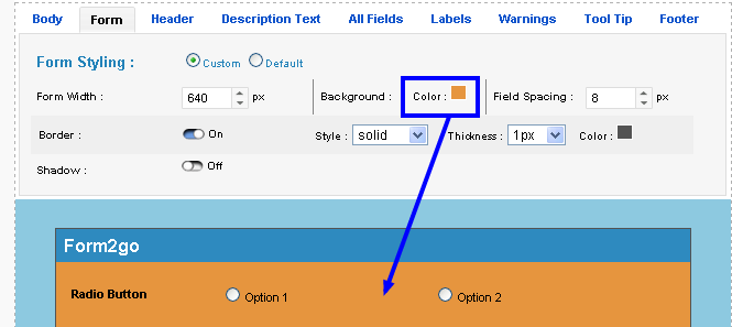
Click on the Form Tab to adjust the Form Styling. 1) Choose between the custom and default form styling options.
2) Set the Form Width to define the dimensions of the form.
3) Choose the background color in the form.
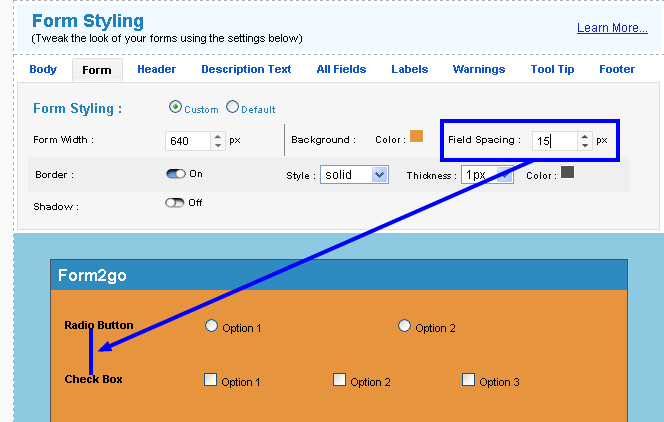
4) Define the field spacing between the fields present in the form.
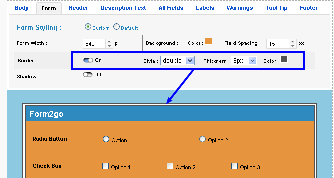
5) Turn the border "on/off" by clicking on the radio button. You can define the thickness and the appearance of the border by the style and thickness options next to the border button.
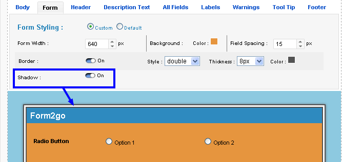
6) Turn on the border shadow by clicking the "on" option.
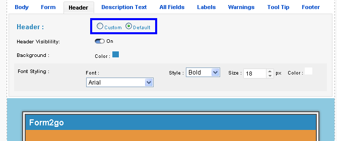
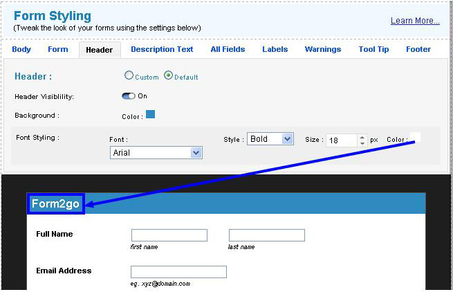
Click on the Header Tab to modify the header on the form. 1) Click on the header options to choose between default or custom settings for the header.
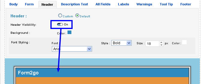
2) Turning on the header visibility ensures that the form header is always visible.
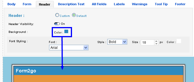
3) Choose the background color of the header.
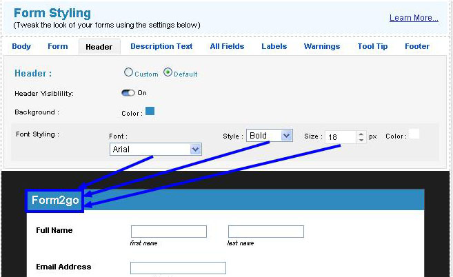
4) Adjust the Font of the header, its styling and the size of the font in the header.
5) Also adjust the color of the header font for the form.
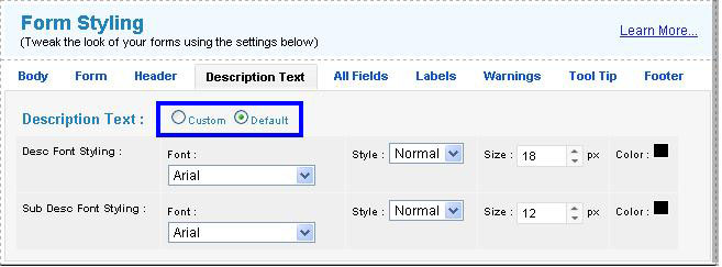
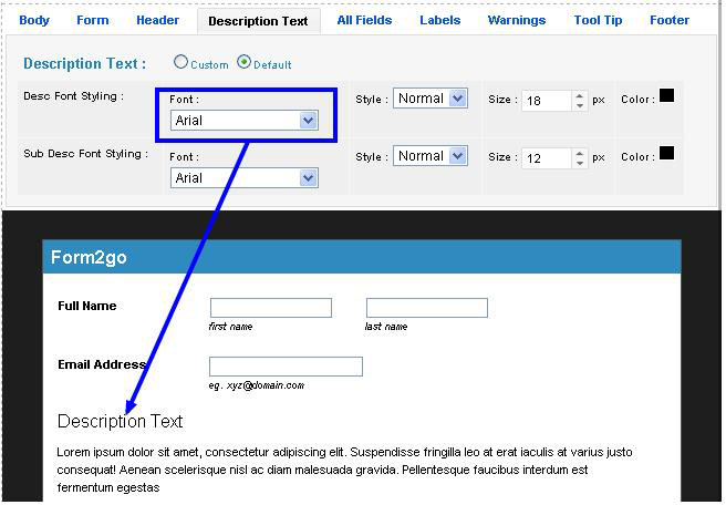
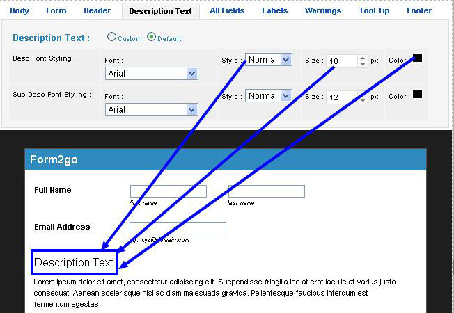
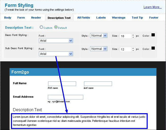
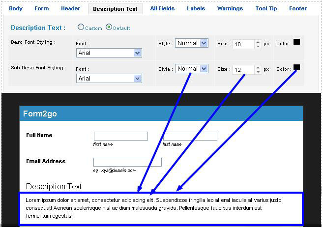
Click on the "Description text" tab to adjust the description text on the form. 1) Choose between the Custom and Default settings of the Description text.
2) Choose a description font.
3) Define the description text styling, size and color of the text.
4) Choose a sub description text font.
5) Define the Sub description text styling, size and color.
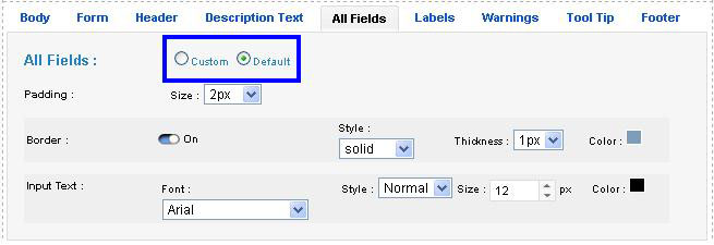
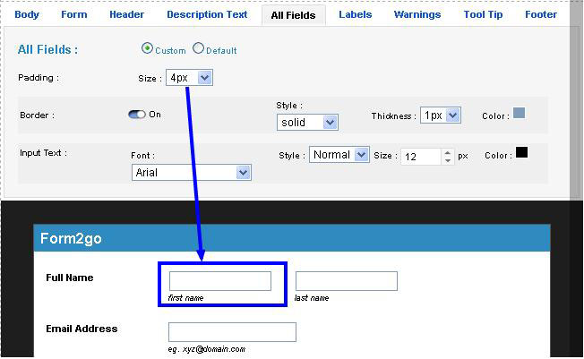
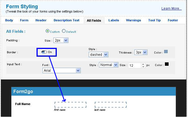
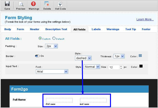
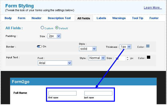
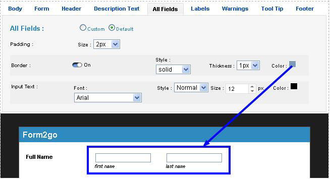
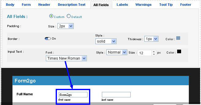
Click on All Fields Tab to adjust the fields in the form. 1) Choose between default and custom settings on the All fields tab.
2) Set the padding to define the space in the field.
3) Turn the field border "on/off".
4) Click on style to set the style of the field border.
5) Click on thickness to define the thickness of the field border.
6) Click on color to set a particular color for the field.
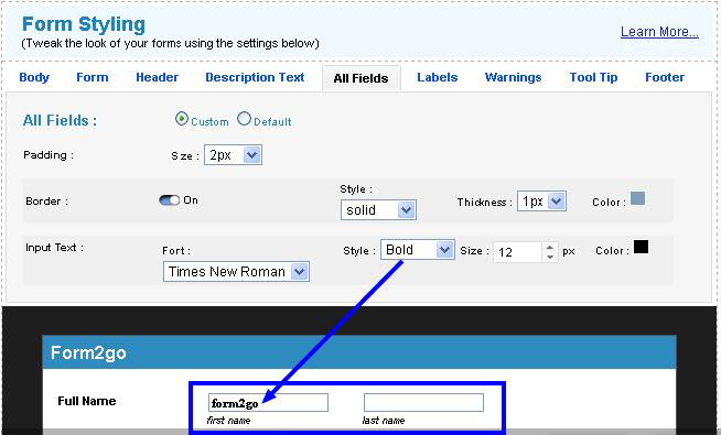
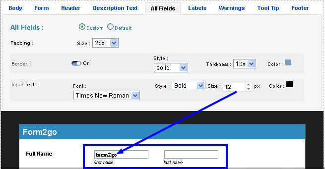
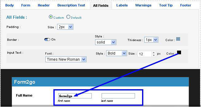
7) In the input text section, select a font for the input text in the field.
8) The next step is to select the style of the input text.
9) Choose a size for the input text.
10) Click on the color to select an appropriate color for the input text.
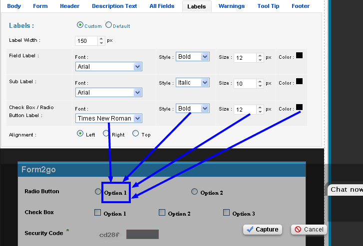
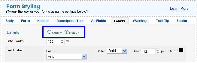
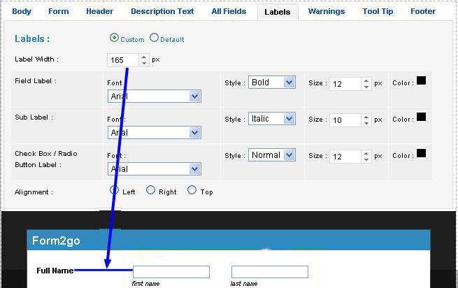
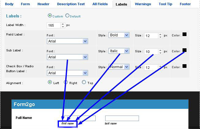
Click on the Labels tab to modify the labels on the form. 1) Choose between custom and default label setting on the form.
2) Set the label width to ensure proper spacing between the label and the fields.
3) Set the field label font, style, size and color by clicking on the respective options.
4) Set the sub label fields similarly by clicking on the options for font, style, size and color.
5) Modify the text for the checkbox/radio button by setting the font, style, size and color options respectively.
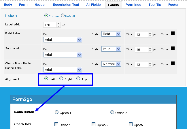
6) Set the alignment of the fields as left, right or top as preferred.
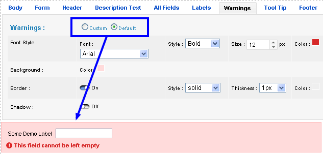
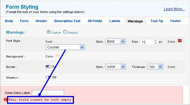
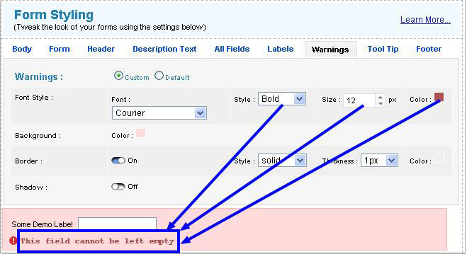
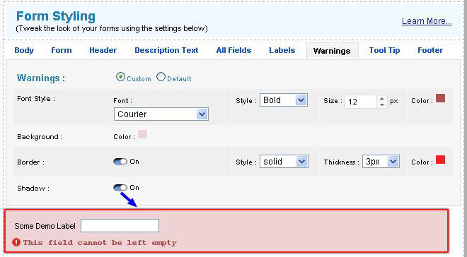
Click on the Warnings Tab to define the appearance of the warnings in the form. 1) Choose between the default and custom settings of the warnings segment.
2) Choose the font option to define a specific font for the warning text.
3) Select the style, size and color for the warning text.
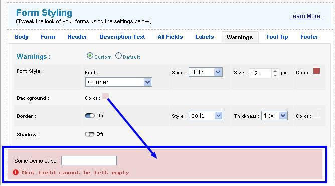
4) The background option sets a color for the background of the warning.
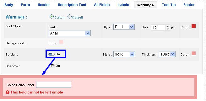
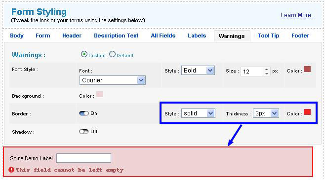
5) Select the border for the warning sign.
6) Define the style, thickness and the color of the border for the warning field by selecting the respective options.
7) Choose to turn the shadow for the border of the field on/off.
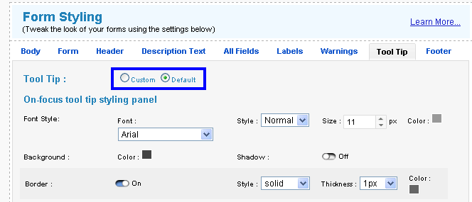
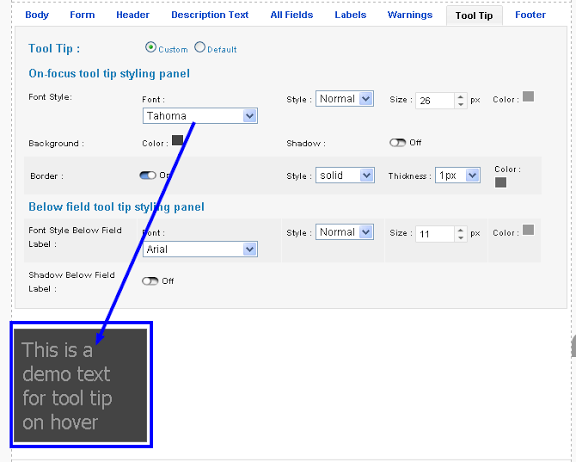
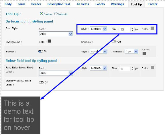
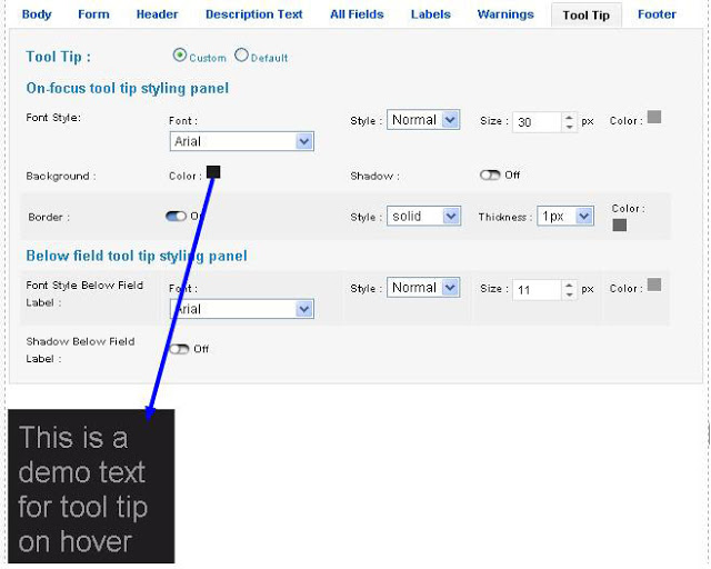
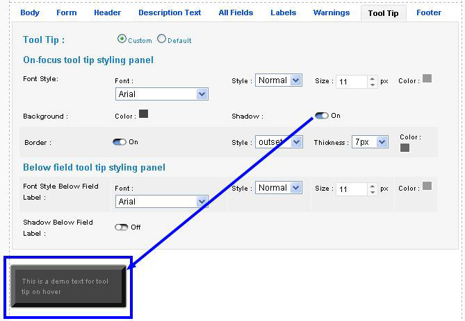
Click on the Tool Tip tab to modify the appearance of the Tool tips in the form. 1) Choose between the custom and default settings of the Tool Tip options The On focus tool tip styling panel helps set the appearance of the tool tip when on focus.
2) Select a font for the tool tip appearance.
3) Set the style, size and color of the font for the Tool tip by selecting the respective options.
4) Set the background color for the tool tip.
5) Turn the shadow on to add shadows to the warning template.
6) Turn the border on to add a border to the warning field.
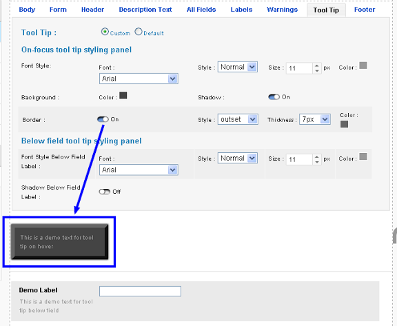
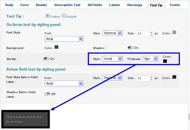
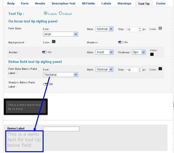
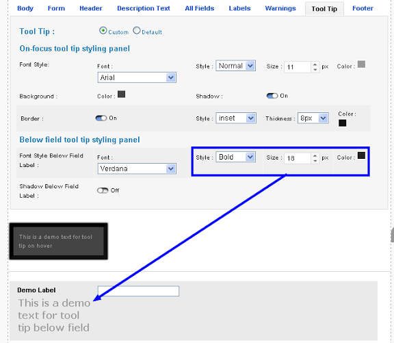
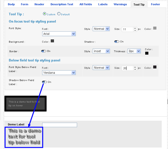
7) Set the style, size and color for the borders by selecting the respective option. The below field tool tip styling modifies the appearance of the tool tip below the field.
8) Select a font for the text of the below the field tool tip appearance.
9) Choose the style, size and color of the font text for the below the field tool tip.
10) Turn the shadow for below the field tool tip on/off.
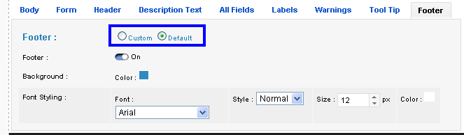
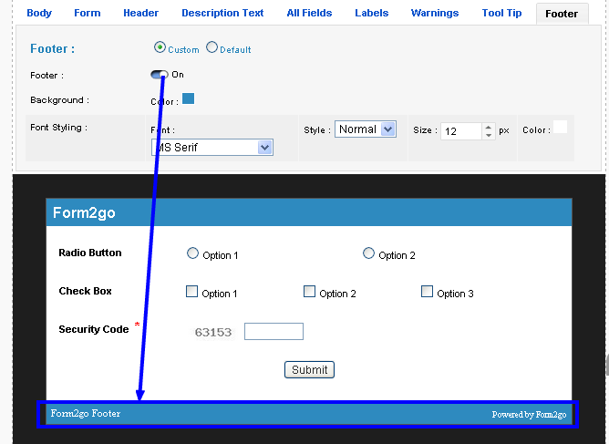
The Footer tab allows modifications to the Footer of the form. 1)Choose between the custom and default options of the Footer.
2)Turning the Footer on would make it visible for users in the form.
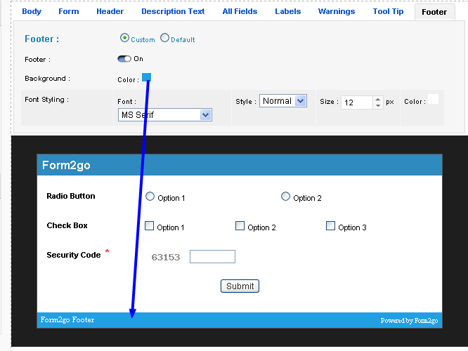
3)Select a background color for the footer.
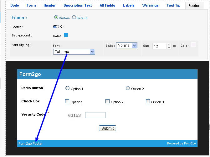
4)Select a font for the Footer through the Font styling options.
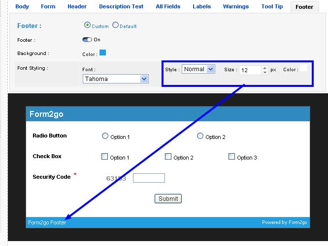
5)Choose a suitable style, size and color for the footer font by selecting the respective options in the Font styling.
| ||||
|
||||
.jpg)